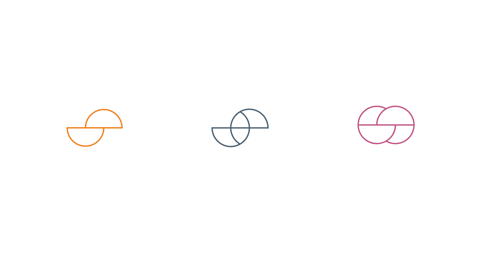
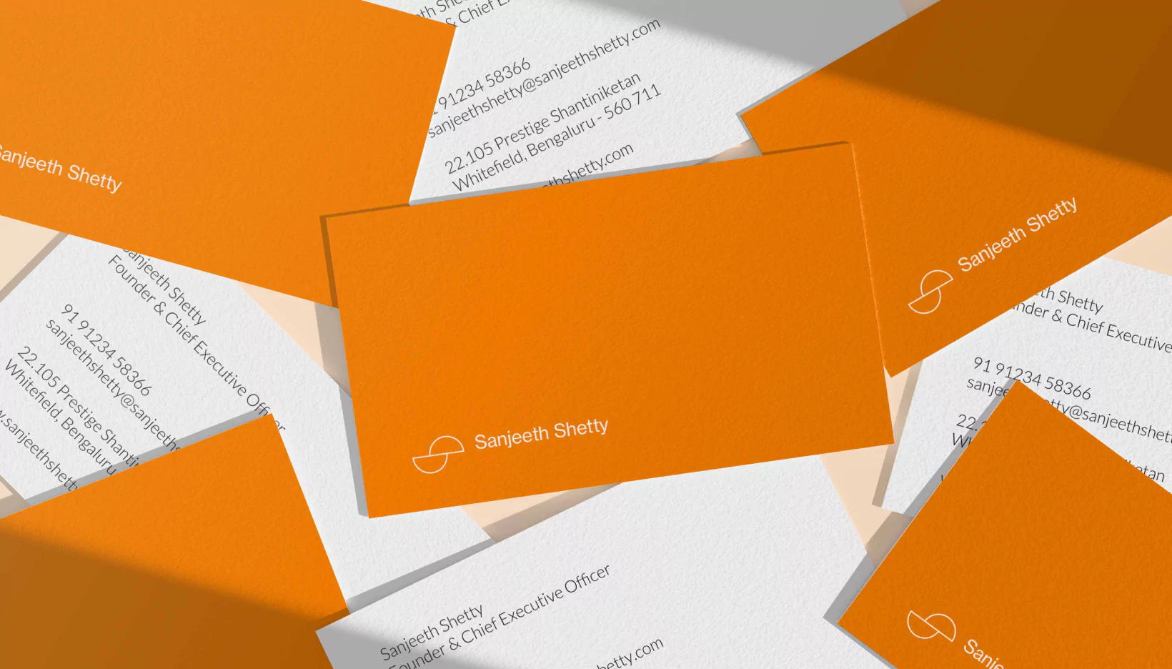
For the personal brand, a minimalist sphere was sliced half and one half was balanced on the centre of gravity of the other. Balanced, yet a potential to see beyond, it reflected the personality of the founder. A vibrant citrus tone was chosen to exhibit energy, creativity and warmth.
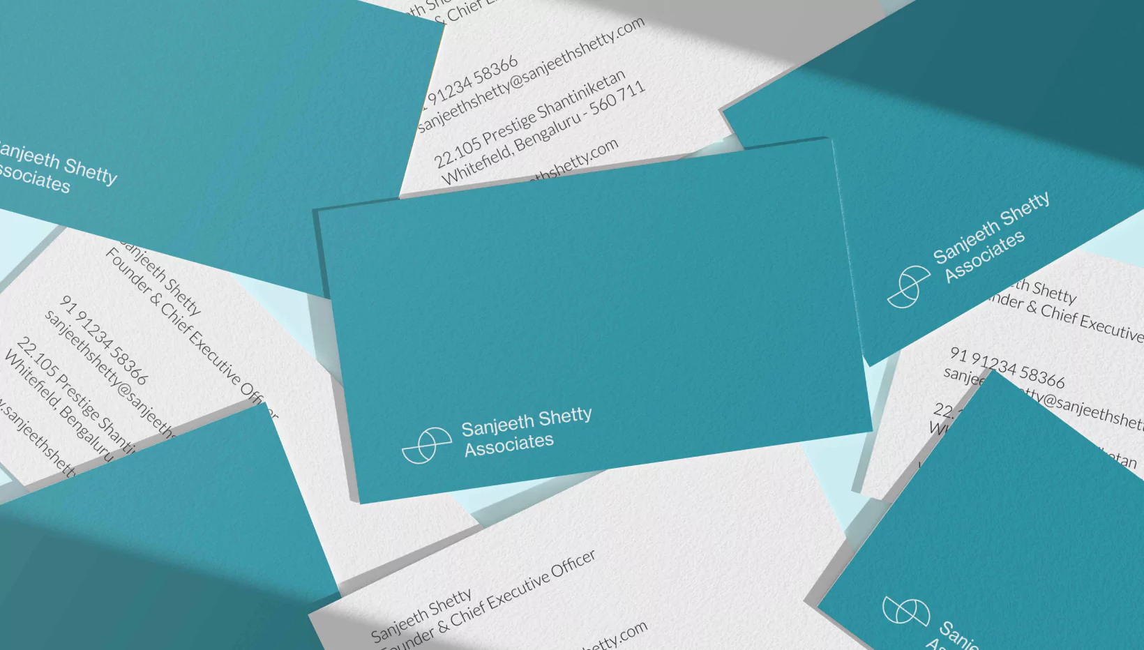
For the MME transformation business, the spheres were interlocked showcasing the investment of the firm into each of its clients’ business. It evoked trust, partnership and equity. The Van Deusen blue lends a flair of sophistication, business and legacy.
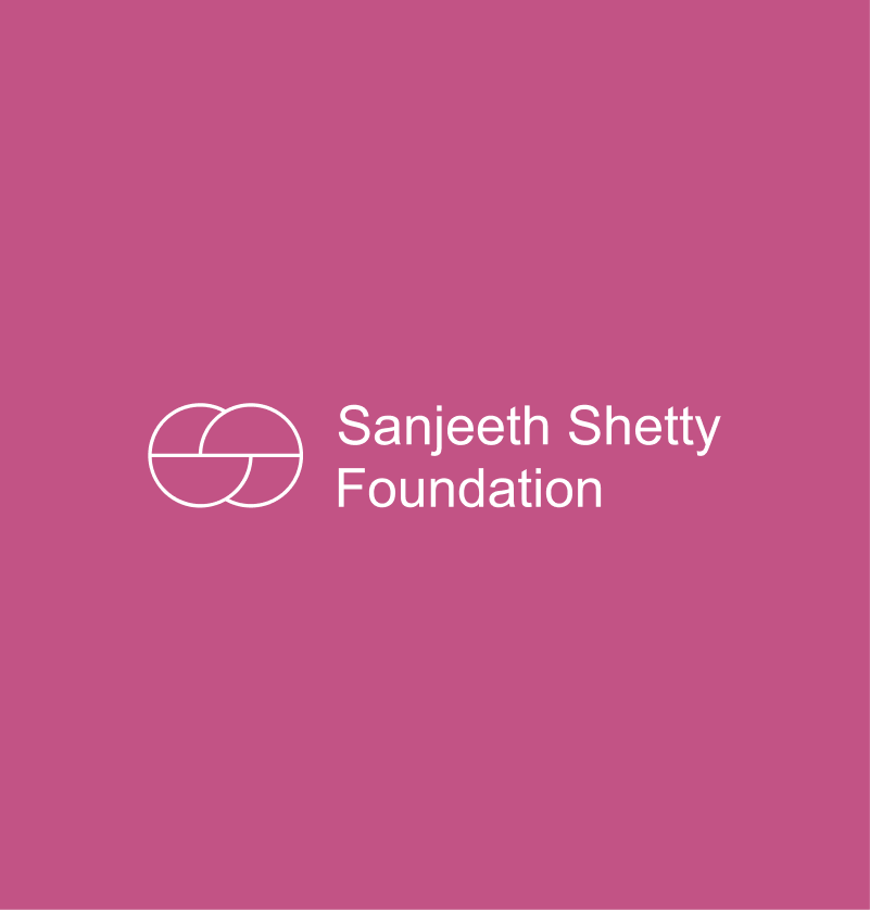
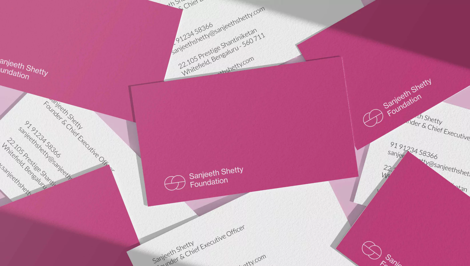
For the charitable foundation, the spheres were transposed to build a robust interlock, reminiscent of the strong foundation values, interdependence and collectivism. The cheerful pink palette denotes nurturing and playfulness.