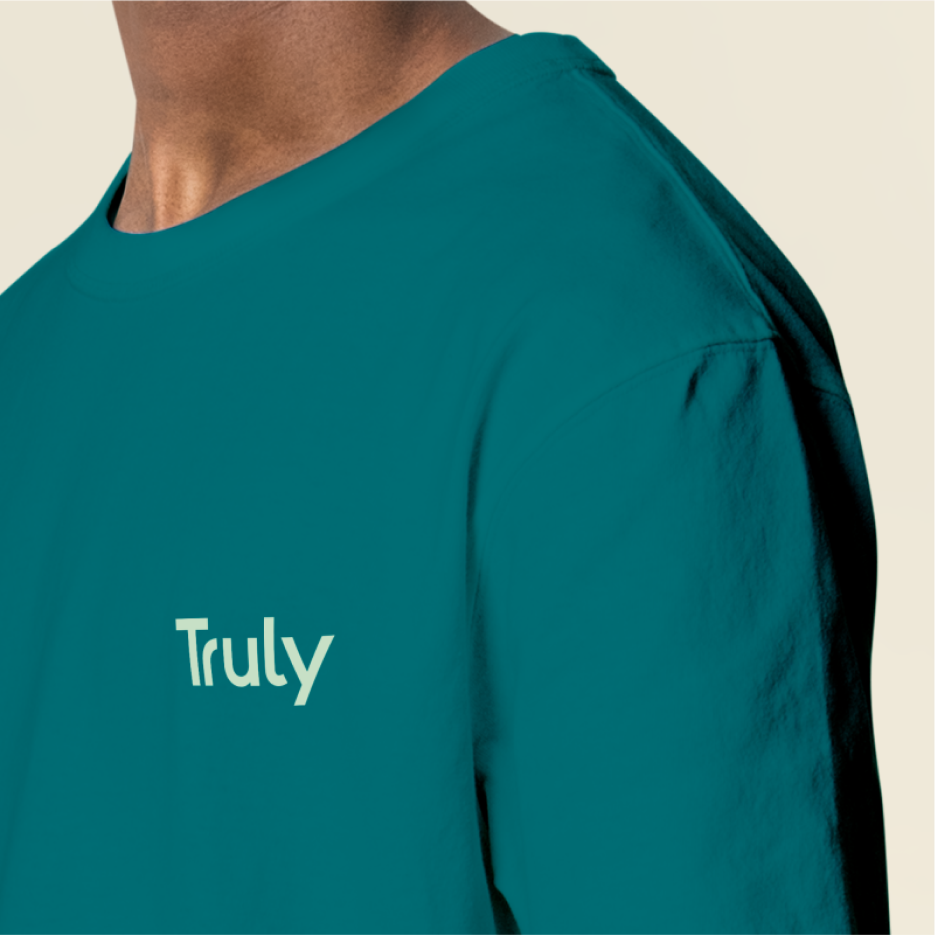
A cool summer palette infused a burst of freshness into the brand, with soft strokes caressing the canvas to form brand motifs. Inspired by nature, the fluid petal pattern was subtle, letting the product take centre stage. The typography was open, devoid of ornamentation - denoting the candid, fuss-free experience for its customers. Brand photography was designed to be intimate, with close, high contrast shots of products. Distancing itself from the expected category colour tones of warm yellow, brown and green; Truly marries the messaging of innocent, consciously processed foods with whites and refreshing cooler tone pastels, allowing it to stand apart and break the clutter in the category.