Client:
Vipragen Biosciences

Contributing to Curiosity

Challenge
Vipragen Bioscience, a pre-clinical CRO, has a strong scientific team with expertise in areas of pre-clinical research and testing. Passionate about their role in improving the health and well being of people, Vipragen needed a brand uplift that echoed with the generation next.

A universe of atoms, an atom in the universe. A brand that is curious, conscious and acknowledges its role as the building block of the future of bioscience.

Approach

The molecular bonds seamlessly connect the various centres of excellence of the brand.

Deliverables

Brand Identity

Brand Extensions

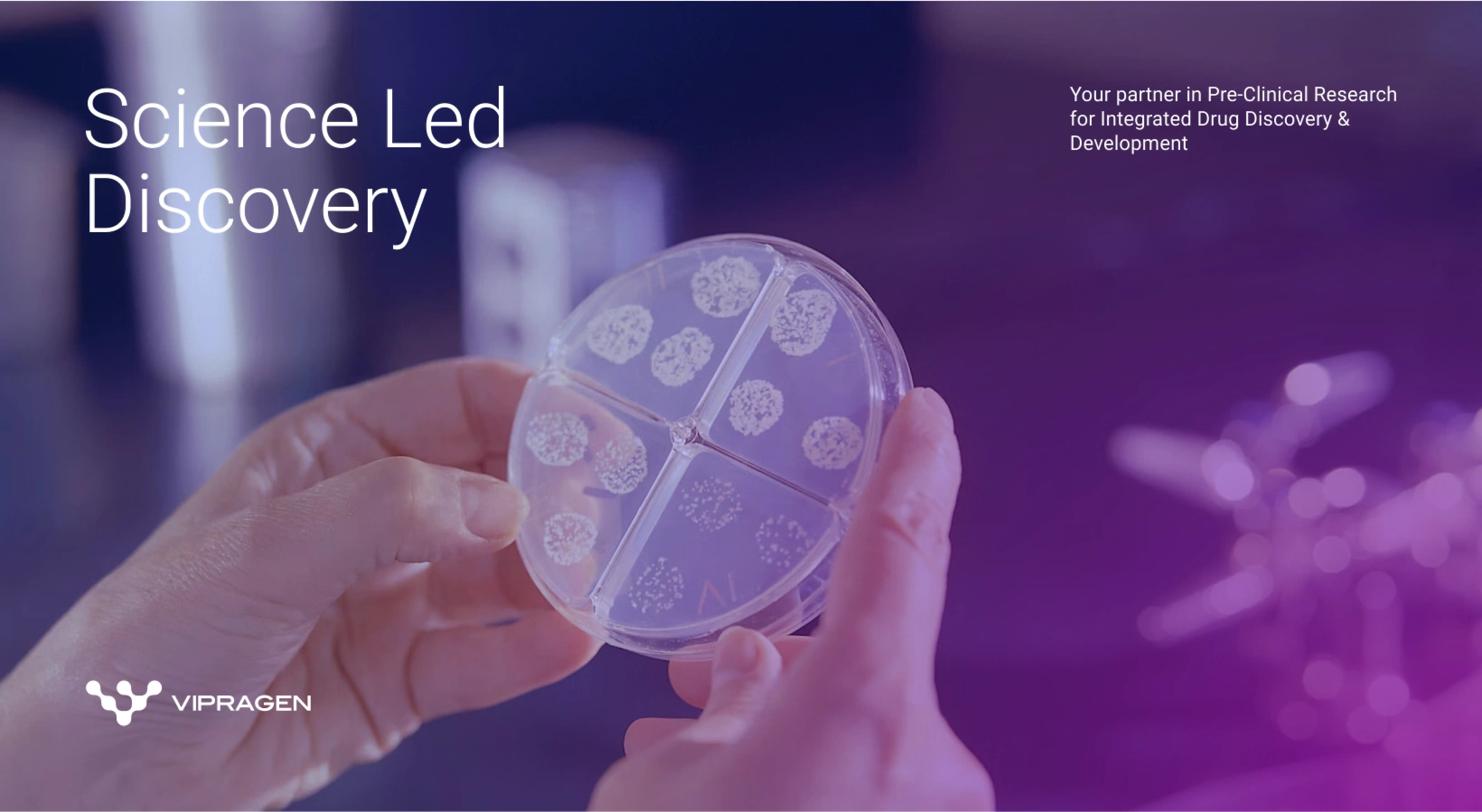
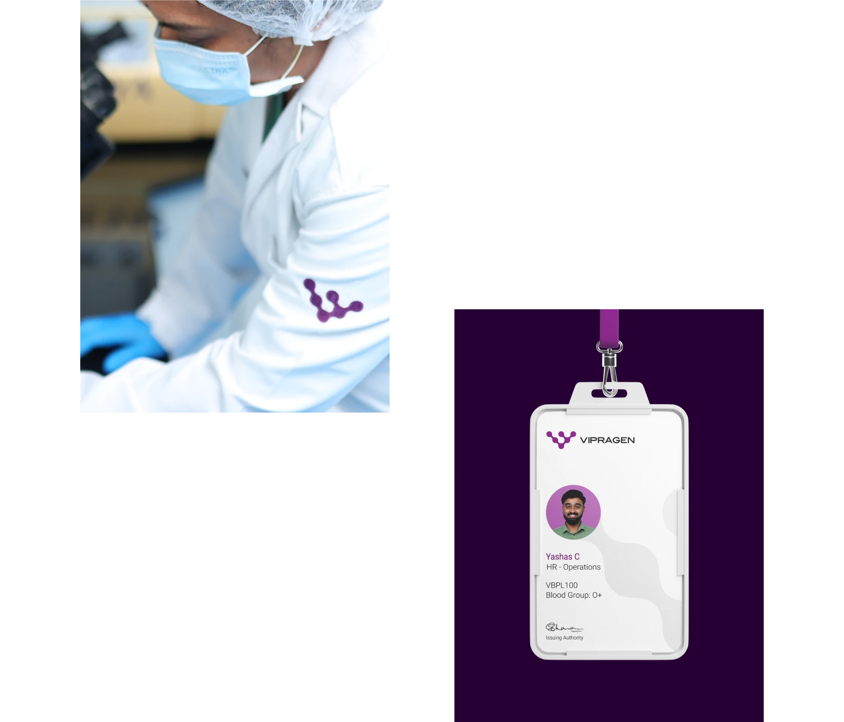
The idea was to break free from the colours usually associated with medicare and biosciences. Sensual and mysterious, spiritual and intuitive, futuristic purple tones dressed the brand identity of Vibragen. The brand logo took its inspiration from the structure of a molecule - the bedrock of the business. Molecular structures were restyled to reflect fluidity in an abstract form to spell the Vipragen insignia. Deep, jewel tones as primary colours and cooler secondary colours allowed the brand to showcase clinical visuals with a touch of warmth and openness. The brand photography was personal and up close, a voyeuristic window into the experience of the end consumer.
Vipragen branding - brochure design
vipragen branding - brochure design